


Your Calgary store gets visitors. Orders trickle in. You pay for ads, then watch shoppers drop items into a cart and vanish.
That’s the problem ecommerce conversion rate optimization in Calgary exists to fix. The goal is simple: get more of the people who already visit to buy.
It’s often the cheapest growth you can find. Doubling your traffic costs real money. Lifting your conversion rate from 1.5% to 2% gives you a third more orders from the same visitors.
Here’s the process I’d follow, from finding the leak to fixing it and testing what works.
What a good ecommerce conversion rate optimization calgary looks like
Conversion rate is the share of visits that end in an order. Many online stores land somewhere between 1% and 3%. Treat that as a loose guide, because your products, prices and traffic sources change the answer.
Your own trend matters more than anyone’s average. Track these five numbers:
|
Metric |
What it tells you |
Where to find it |
|
Conversion rate |
How many visits become orders |
Your store’s analytics or GA4 |
|
Add-to-cart rate |
How appealing your product pages are |
Store analytics |
|
Cart abandonment rate |
How much friction sits in the cart and checkout |
Store analytics or GA4 funnels |
|
Average order value |
How much each order brings in |
Store reports |
|
Revenue per visitor |
Conversion rate and order size combined |
Orders divided by sessions |
Split every number by device and by traffic source. A blended figure hides the problem. A mobile rate of 0.8% beside a desktop rate of 2.5% tells you exactly where to start.
Why a Calgary store needs a local angle
Generic advice ignores the details Canadian shoppers care about. These make a real difference to ecommerce conversion rate optimization in Calgary:
- Prices in Canadian dollars. Never make people guess the exchange rate.
- Clear tax. Alberta has no provincial sales tax, only 5% GST, but customers elsewhere in Canada pay different rates. Show the total before checkout.
- Local pickup. Offer pickup from your Calgary location. Some shoppers love getting an order the same day.
- Honest delivery times. Canada is huge. Show estimates by region instead of a vague “5 to 10 days.”
- Duties and fees. If you ship from the US, say who pays. Surprise charges at the door kill repeat orders.
- Familiar payment options. Many Canadian shoppers expect Interac or wallet options like Apple Pay.
A local address and a real phone number also build trust fast. More on that in Step 5.
Step 1: find where shoppers drop off
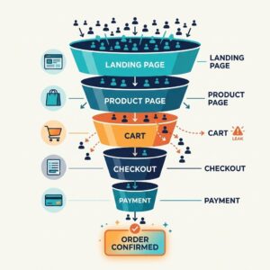
Don’t change a single button until you know where people leave. Open your store’s funnel report and follow shoppers from first visit to payment.
|
Stage |
Warning sign |
Likely cause |
|
Landing or collection page |
High bounce rate |
Wrong traffic, slow loading or a confusing layout |
|
Product page |
Few add-to-carts |
Weak photos, unclear price or missing proof |
|
Cart |
Many abandoned carts |
Surprise costs or no clear next step |
|
Checkout |
Drop-off on the first screens |
Forced accounts or long forms |
|
Payment |
Failed or abandoned payments |
Missing payment options or errors |
Numbers tell you where. People tell you why. Add two more sources:
- Session recordings and heatmaps. Watch 20 mobile checkout sessions. You’ll spot problems no report shows.
- Customer questions. Read your chat logs and support emails. Repeated questions point straight at missing information on your pages.
If the leak starts at the landing page, you may be attracting the wrong visitors. Our SEO services team works on bringing in shoppers with buying intent.
Then write down the three biggest leaks. That list drives the rest of your plan.
Step 2: fix your product pages
Product pages do the selling. A shopper can’t touch the item, so your page has to answer every question they’d ask in a shop.
Show the product properly
Use several photos per item: front, back, close-up and in use. Add a scale shot so people grasp the size. A short video helps for anything with moving parts or a fit question.
Answer questions before they’re asked
Lead with what the product does for the buyer. Then list specifics in short bullets: size, materials, fit, compatibility and care. Add a small FAQ for the questions your support team hears most.
Put price, delivery and returns next to the button
Shoppers hunt for these. If they have to leave the page to find shipping costs, many won’t come back.
Add proof
Star ratings and written reviews lift confidence. Photo reviews work even better because they show real people using the product. Show the number of reviews so a 5.0 from two people doesn’t look suspicious.
Make the next step obvious
One clear button, in a colour that stands out, visible without scrolling on a phone. A sticky “Add to cart” bar helps on long pages.
If your theme limits what you can do on a product page, our website design and development team builds ecommerce stores on Shopify and WordPress.
Step 3: speed up the store and fix mobile
Slow pages leak sales before anyone sees your products. Most of your shoppers are probably on phones, so mobile comes first.
Speed
Test your key pages with Google’s PageSpeed Insights. Then work through the usual suspects:
- Compress and resize images
- Remove apps and plugins you don’t use
- Limit third-party scripts such as chat widgets and trackers
- Use a content delivery network if your host offers one
Mobile
Pick up a real phone and buy something from your own store. Can you tap every button without zooming? Does the keyboard cover the form field? Does autofill work?
Big thumb-friendly buttons, short menus and wallet payments like Apple Pay and Google Pay all lift mobile conversions.
Keep it that way
Speed slips as apps and plugins pile up. Our guide to website maintenance for ecommerce stores covers the routine checks that keep a store quick and stable.
Step 4: simplify checkout
Roughly 7 in 10 online carts never turn into orders. Baymard Institute’s list of cart abandonment statistics puts the documented average at about 70%. Some of those people were only browsing. Plenty were ready to buy until checkout got in the way.
These fixes help most:
- Show the full cost early. Unexpected shipping, tax and fees are the reason shoppers give most often for leaving. Put an estimate in the cart.
- Offer guest checkout. Forcing an account sends people away.
- Cut form fields. Ask only for what you need to ship the order. Add address autocomplete.
- Offer the right payment options. Cards, Interac, PayPal, Apple Pay and Google Pay cover most Canadian shoppers.
- Show progress. A simple “Step 2 of 3” keeps people moving.
- Make errors easy to fix. Flag the problem field right where it happens instead of clearing the whole form.
- Keep trust cues in view. Show your return policy link, a contact number and secure payment icons on the checkout page.
Change one thing at a time and watch your cart abandonment rate for two weeks.
Step 5: build trust
Shoppers hand over card details to strangers. Give them reasons to relax.
- A returns policy in plain words. Put it on product pages and in the footer. A generous, clear policy often lifts sales more than it costs.
- Real reviews. Collect them after every order. Link to your Google reviews too.
- Contact details everywhere. A phone number, an email and a Calgary address tell people a real business stands behind the store.
- An About page with faces and names. People buy from people.
- Fast replies. If you offer chat, answer within minutes during business hours.
Step 6: win back shoppers who leave
Some people will always leave. Plan for it.
- Abandoned cart emails. Send the first within an hour. Follow up the next day. If a third email goes out, save any discount for that one.
- Retargeting ads. Show people the exact product they viewed. Cap how often they see it so you don’t annoy them.
- Back-in-stock alerts. An email when a sold-out item returns catches buyers who already wanted it.
- A saved cart. Let customers email themselves their cart or save it to an account.
Canada’s anti-spam law, CASL, generally requires consent before you send marketing messages. Collect it at checkout with a clear tick box and make unsubscribing easy.
After the sale, ask for a review and suggest a matching product. Repeat customers usually convert at a higher rate than first-timers. They cost far less to reach.
Step 7: test changes properly
You now have a long list of ideas. Rank them by impact and effort, then start where the payoff is highest and the work is lightest.
|
Idea |
Impact |
Effort |
Priority |
|
Show shipping cost in the cart |
High |
Low |
Do first |
|
Add guest checkout |
High |
Low |
Do first |
|
Rewrite your top five product pages |
Medium |
Medium |
Do next |
|
Add photo reviews |
Medium |
Medium |
Do next |
|
Redesign the checkout layout |
High |
High |
Plan it |
|
Switch themes |
Medium |
High |
Later |
Test each change with a few simple rules:
- Pick the metric first. Decide what counts as a win before you start.
- Change one thing at a time. Otherwise you won’t know what worked.
- Run it long enough. Two full weeks covers weekday and weekend habits.
- Be careful with small numbers. A true A/B test needs plenty of visitors. A small store can compare before and after, but should treat the result as a hint.
Write every change in a log with its date and result. Next quarter, you’ll be glad you did.
Mistakes that waste months
- Redesigning the whole store at once. You lose the ability to see what helped.
- Copying a giant retailer’s checkout. Their traffic, brand and budget differ from yours.
- Buying more traffic before fixing the leaks. More visitors into a leaky funnel just costs more.
- Reaching for discounts first. Constant sales train customers to wait for the next one.
- Ignoring mobile. Check it on a real phone every time you change something.
- Judging by one blended number. Split by device and traffic source or you’ll chase the wrong problem.
When to bring in a Calgary partner
You can do a lot yourself. Call for help when:
- Your theme fights every change you try to make
- Fixes need real development work, such as a custom checkout
- You can’t tell why conversions are flat
- You’d rather spend your time on products than on spreadsheets
If the store itself is holding you back, a rebuild on a platform that fits may beat years of patching. Check your traffic quality too, because conversion rate also depends on who arrives.
Conclusion: fix the leaks you already have
Ecommerce conversion rate optimization in Calgary comes down to a short list. Find where shoppers leave, fix the product pages and checkout, build trust and test one change at a time.
This week, pick the single biggest leak from Step 1 and fix it. One honest improvement beats ten half-finished ones.
Want a team to run the audit with you? Talk to our digital marketing team about turning more of your store’s visitors into customers.